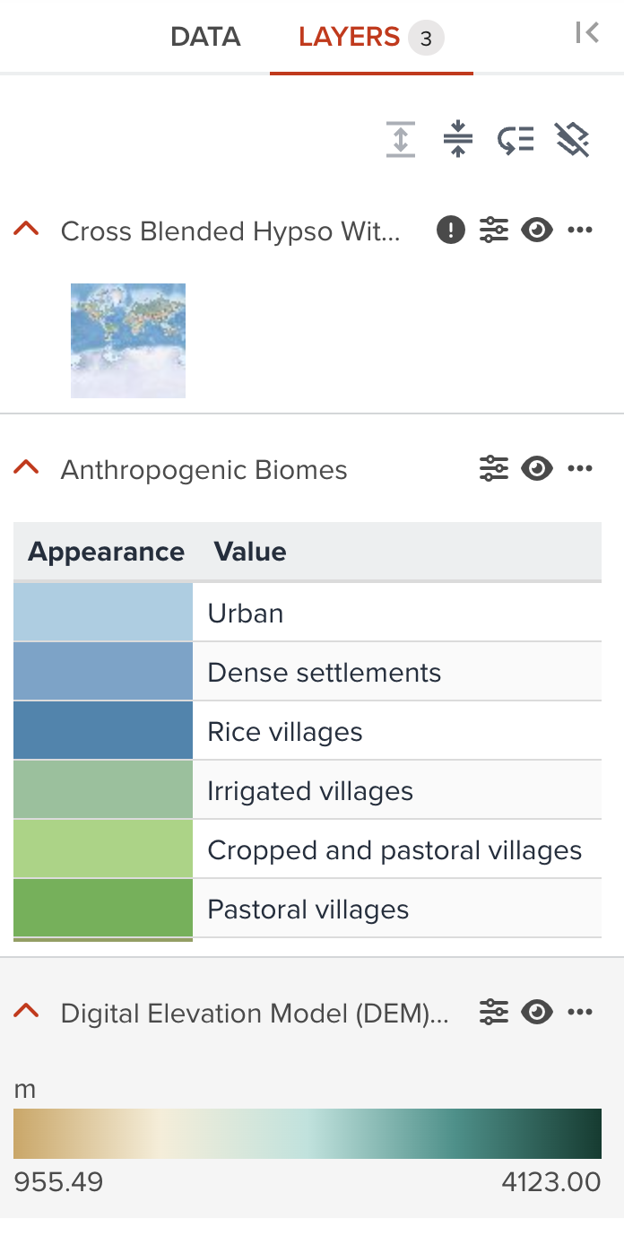
Raster data visualization
The types of raster data layer
--
There are three types of raster layers as follows.
- A raster data that has a linear values (General raster in GeoHub)
- A raster data that has a unique values with label information (Call
Unique value rasterin GeoHub) - A raster data that has true color image with 3 or 4 bands (RGB or RGBA).
Style editing components
Except the Opacity property described in the previous section, the following visualization components for a raster data layer are available in Geohub. But some of components may not be available according to the raster layer type.
| Component | General raster | Unique value raster | True color raster |
|---|---|---|---|
| Color | Available | Limited | N/A |
| Rescale Min/Max Values | Available | N/A | N/A |
| Resampling | Available | Available | Available |
| Brightness Max | Available | Available | Available |
| Brightness Min | Available | Available | Available |
| Contrast | Available | Available | Available |
| Hue Rotate | Available | Available | Available |
| Saturation | Available | Available | Available |
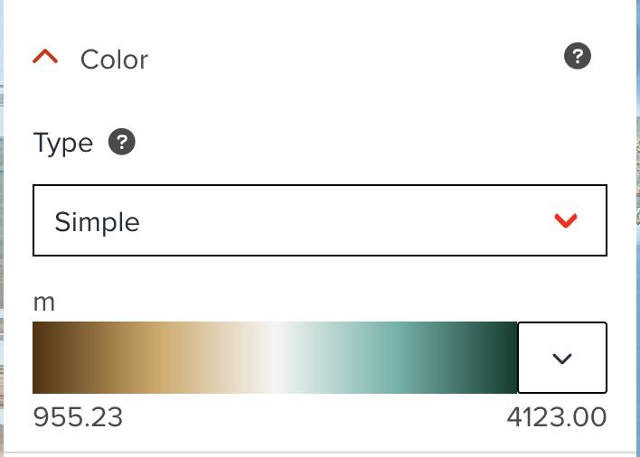
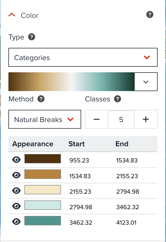
Color
General raster layer
Most raster datasets in GeoHub has this Color property to able to switch between Simple linear legend and Categorized legend from dropdown menu.
--
Simple linear legend
As default, this simple legend is selected. You only can change colormap for this legend. Minimum and maximum values from raster statistics are also shown in the legend. If Unit tag is available in the dataset, you maybe can see unit name together.
--
Categorized legend
When you select Categories from dropdown, this categorized legend is generated automatically.
--
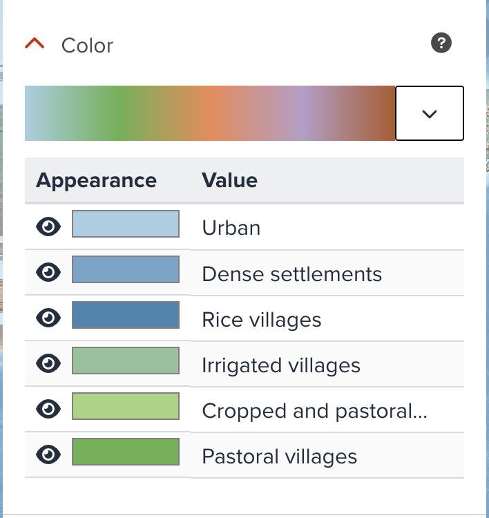
Unique value raster layer
As mentioned ealier, some raster datasets are unique value raster. In this case, Color property is also available, but its functionality is limited.
Rescale Min/Max Values
When the default visualization does not look good, you may need to adjust minimum and maximum values to rescale to achieve the better visualization.
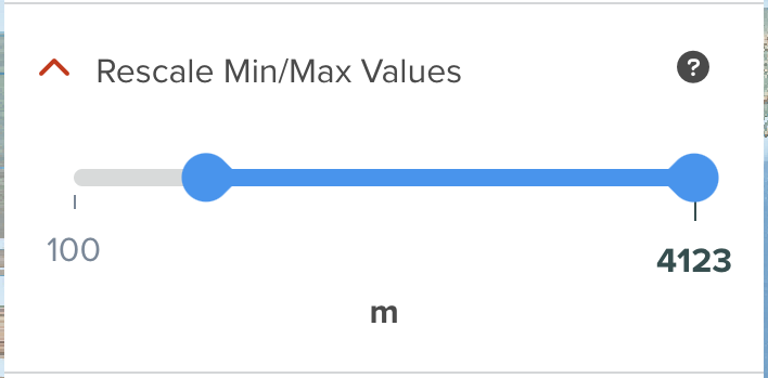
Please have a look at histogram section, it describes how you can use statistics in histogram to adjust rescale values.
Resampling
The resampling/interpolation method to use for overscaling, also known as texture magnification filter.
-
Bi-linear: (Bi)linear filtering interpolates pixel values using the weighted average of the four closest original source pixels creating a smooth but blurry look when overscaled -
Nearest neighbor(default): Nearest neighbor filtering interpolates pixel values using the nearest original source pixel creating a sharp but pixelated look when overscaled
Brightness Max
Yoou can increase or reduce the brightness of the image between 0 and 1. The value is the maximum brightness, and default is 1.
Brightness Min
You can increase or reduce the brightness of the image between 0 and 1. The value is the minimum brightness, and default is 0.
Contrast
You can increase or reduce the contrast of the image between -1 and 1.
Hue Rotate
You can adjust rotates hues around the color wheel between 0 and 359.
Saturation
You can increase or reduce the saturation of the image between -1 and 1.
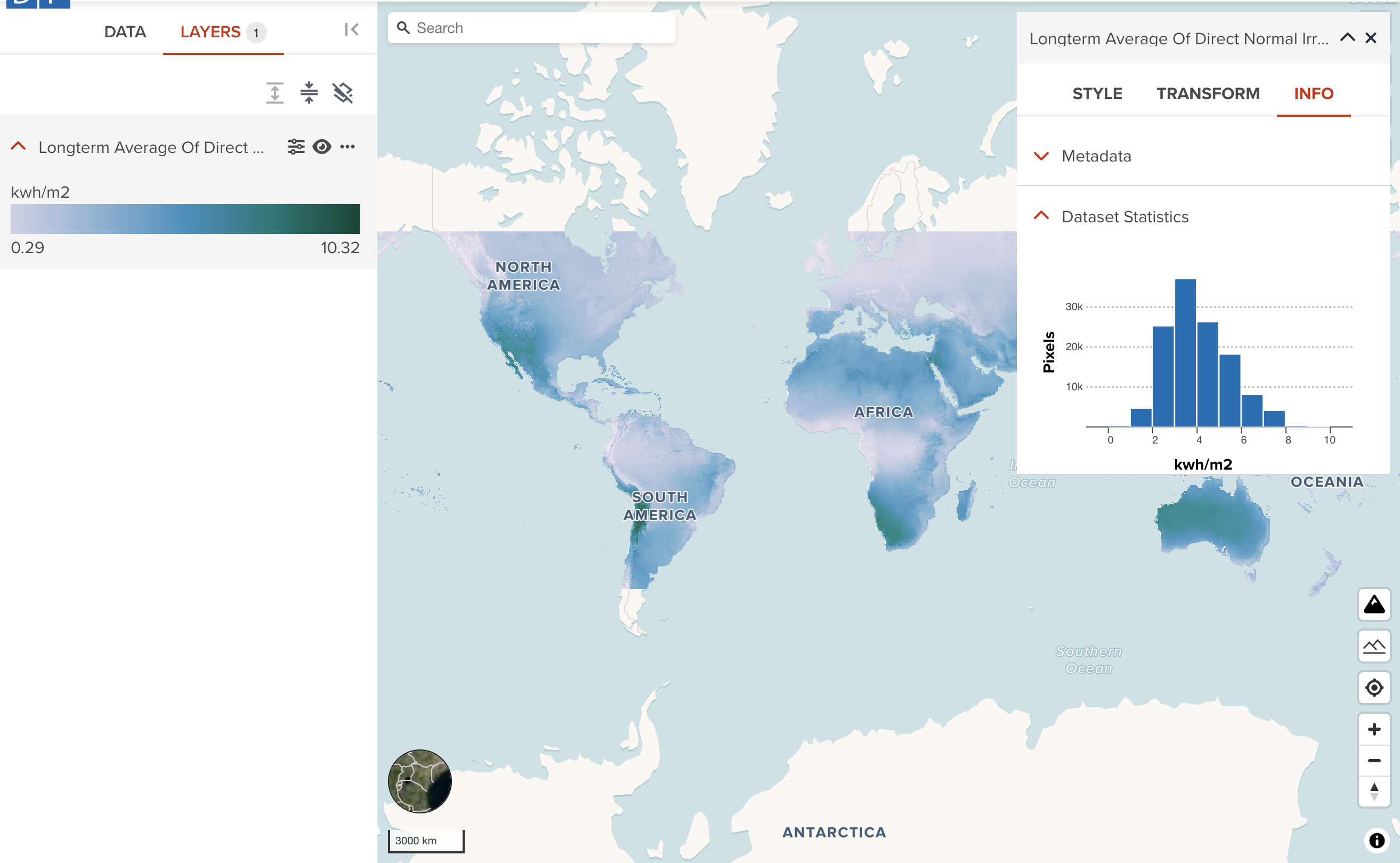
How Histogram can be used for visualization
GeoHub offers the user to display their data set’s statistical information using a histogram which enables the user to determine skewness and kurtosis of the data set.
--
The first example displays the histogram for the Long-term Average Of Direct Normal Irradiation data set with a normal distribution and the second example is from the highly sked data set for the Population Density of 2020.
--
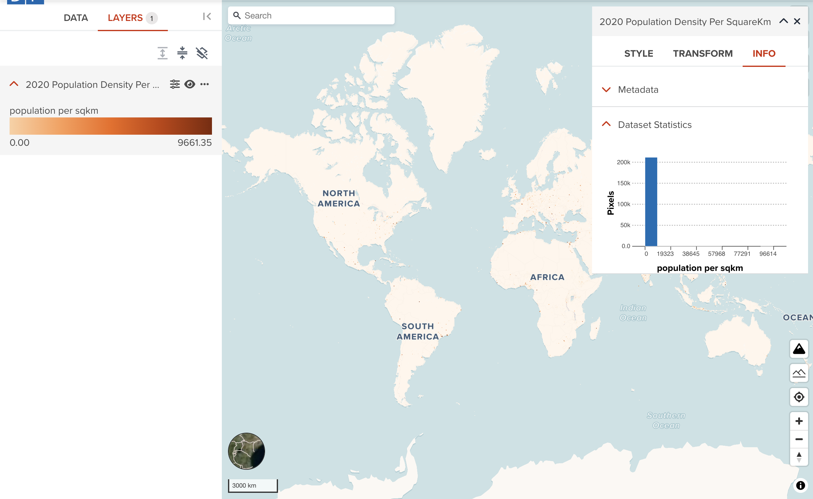
As you can see, normal distribution data can be visualized quite well as default. However, visualization of highly skewed data is a little bit tricky although GeoHub is trying to optimize default setting. You may need to adjust rescale property for better visualization.
--
The below example is the Population Density of 2020 layer after adjusting rescale property. Now you can see the significant difference between before and after rescaling.
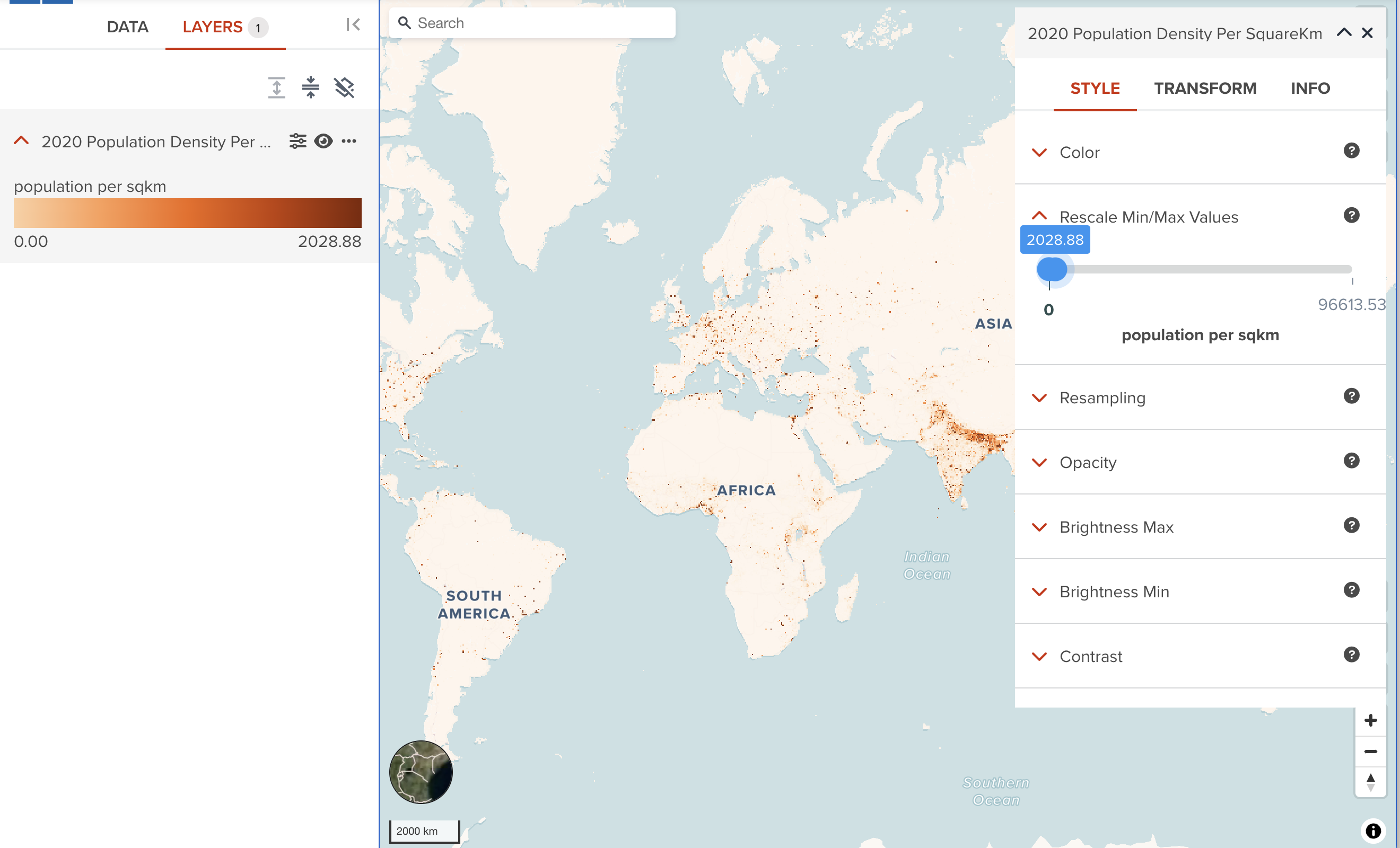
It is worth to check how the data distribution looks like in case the default visualization does not look good.
Transform tab (Advanced)
The raster transform tab provides an ability to filter the data in a different way of rescaling.
Here, we use Digital Elevation Model (DEM) 10m resolution, Rwanda dataset as an example to show each step how you can transform it.
--
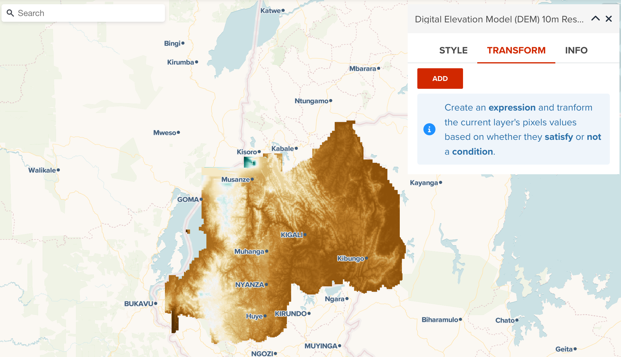
- Click Add button under TRANSFORM tab
Open a layer editor panel, move to the TRASFORM tab, then click ADD button.
--
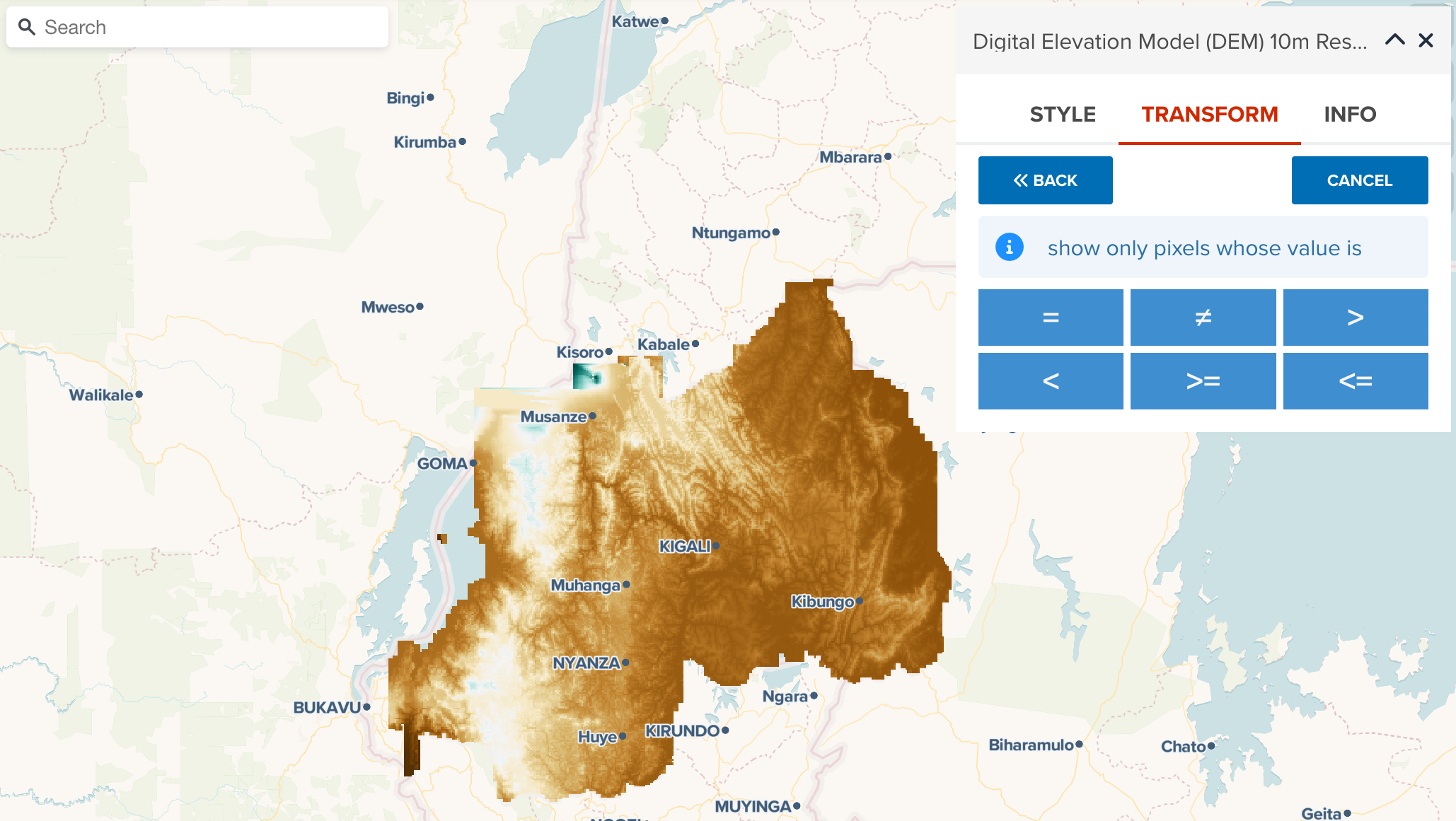
- Select a math operator for filtering.
Firstly, you will be asked to select a mathmatics operator.
--
the following operators are available for raster transform.
=: Equals. Only show pixels which exactly matched threshold≠: Differs. Show pixels except exactly matched to threshold.>: Larger than. Show pixels which have greather than threshold value.
--
<: Smaller than. Show pixels which have less than threshold value.>=: Larger than or equal to. Show pixels which have greater than or equal to threshold value.<=: Smaller than or equal to. Show pixels which have less than or equal to threshold value.
Here, we select < (less than) operator.
--
- Select a threahold and apply filter
Then, select a threshold and click APPLY button to apply new filtering rule for a raster dataset.
--
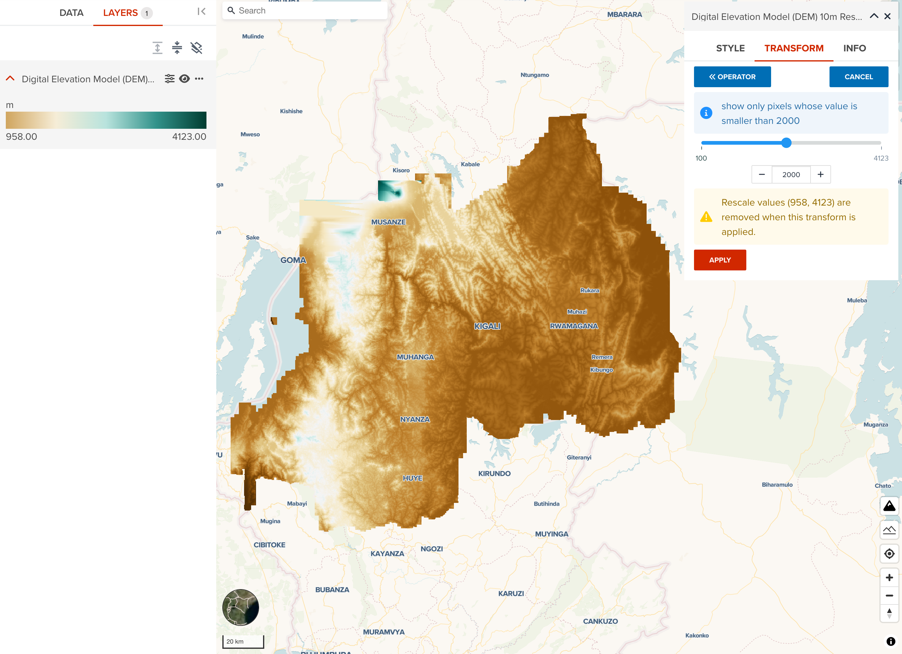
Note
You can use a slider to roughly move it to the place which you disire to filter. Then, use ← (-) or → (+) butto, or manually input at textbox in your keyboard to adjust the threshold precisely.
Warning
If you have changed layer minimum and maximum values from Rescale property, your rescale setting will be removed when new transform rule is applied. But you can still can change rescale after applying transforming rule.
--
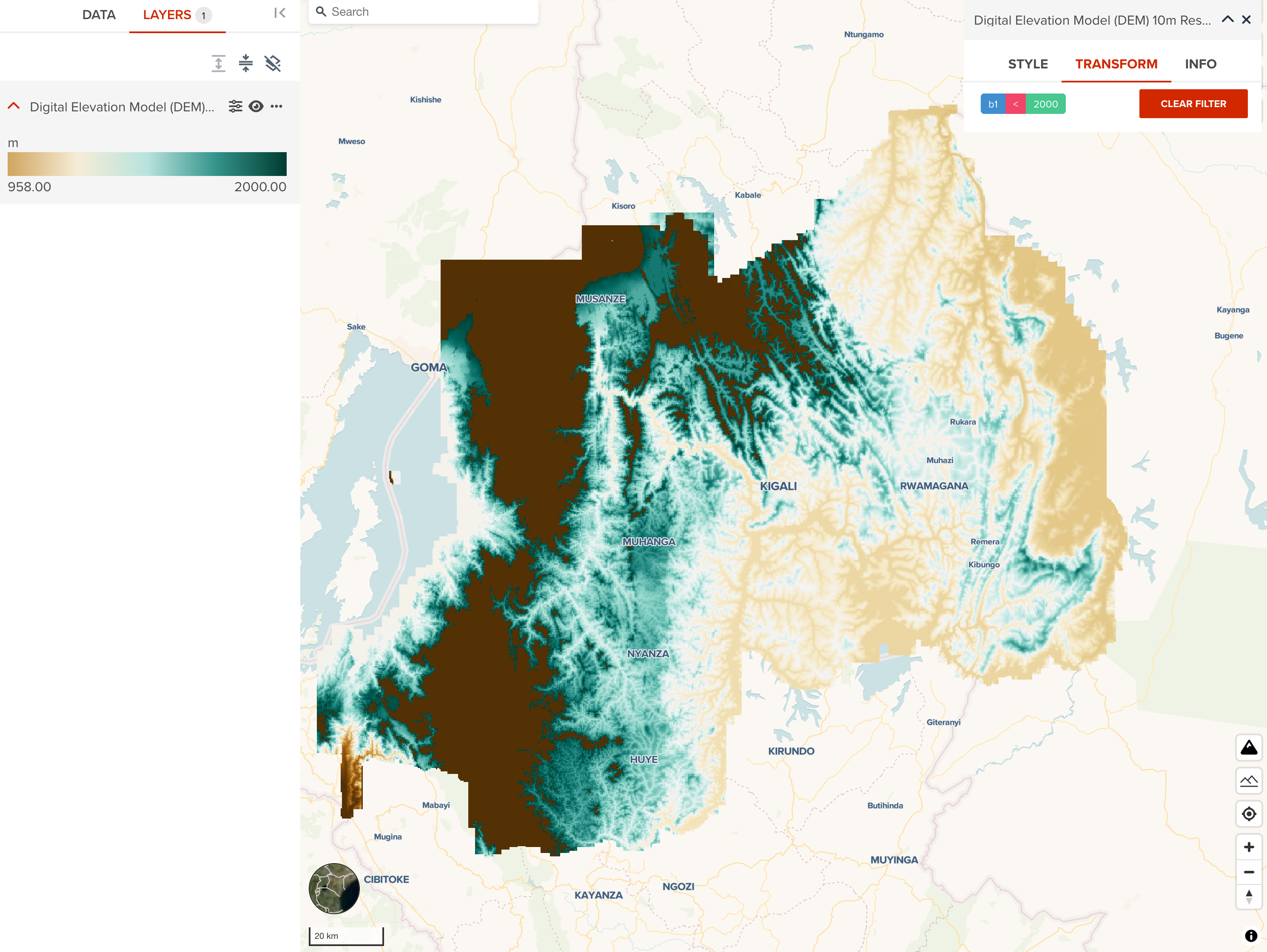
- The result after transforming
The following figure shows the result after applying the rule which the first band value is less than or equal to 1999m. If you compare the screenshot before applying a filter, you can clearly see what the difference is.
--
This raster transform can retain the original colormap after adding new transform rule, but it changes rescale setting from the latest layer statistics. In this example, the pixels which have altitude is less than 2000 use the same colormap with before. But pixels more than 1999m altitude shows dark brown color. To achieve the best result of visualization, it is recommended to visit Rescale property, and set the appropriate min and max values as well.
Next step
We have explored how raster layer can be visualized in this section. We are going to explore about colormaps used in GeoHub.