Heatmap visualization
Heatmap is a quite useful visualization if you want to show the geographic clustering to emphasize how point dataset denses.
--
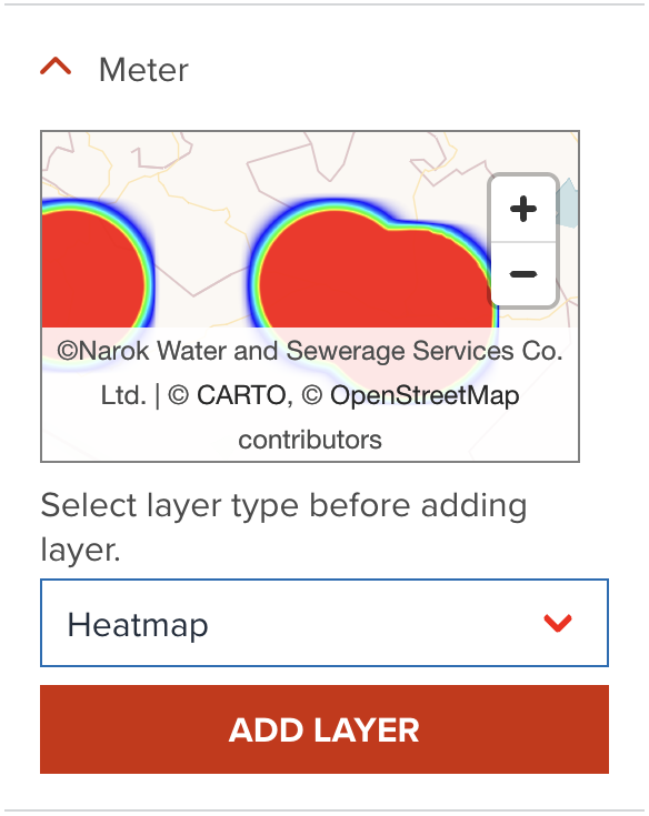
As default, GeoHub adds point data as a point layer. If you wish to add heatmap layer for the point data, you need to select heatmap layer type before clicking add button as shown in the below.
--
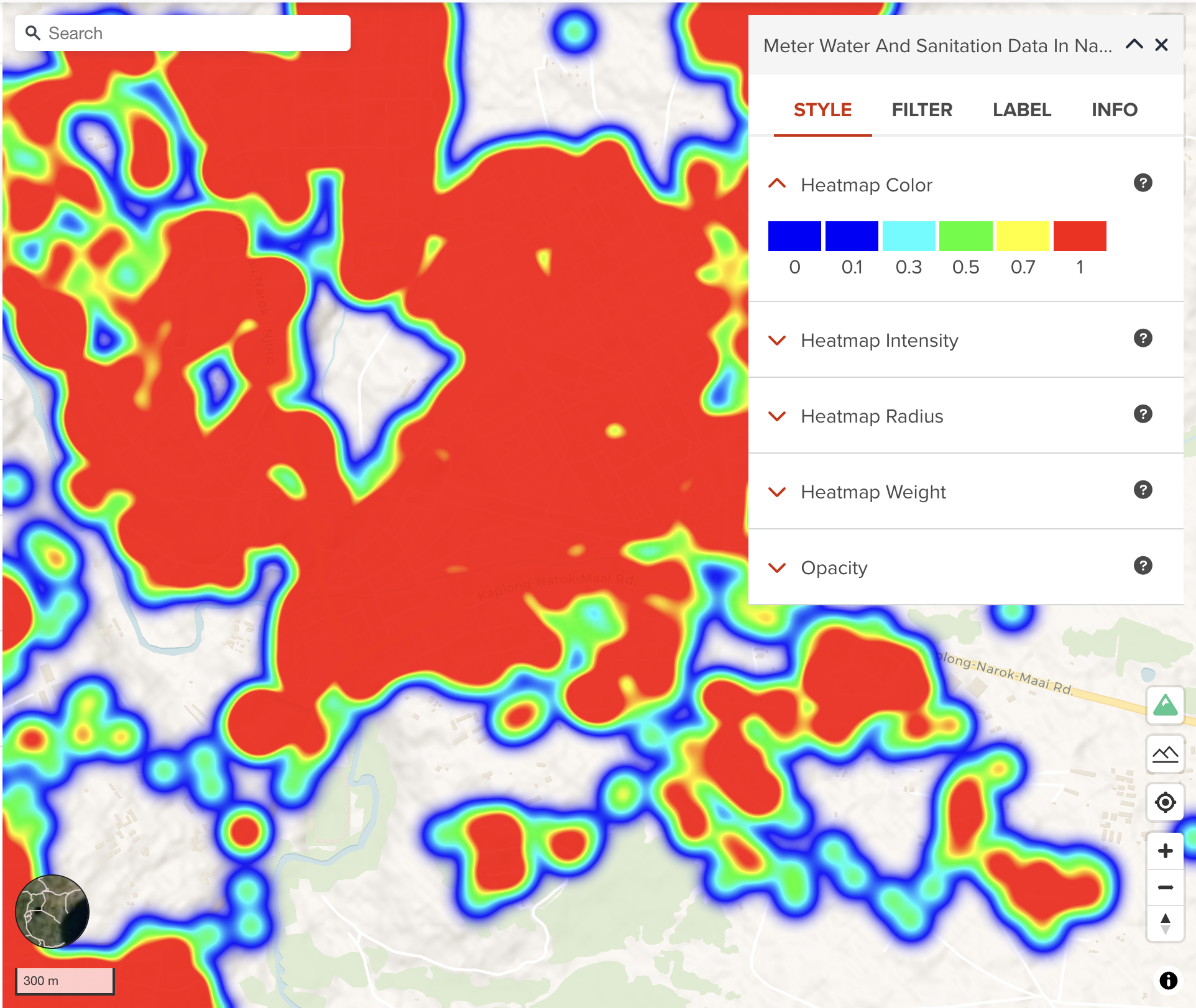
Once, the layer is added, heatmap will be shown like the following figure.
Heatmap color
As default, GeoHub creates heatmap with default standard colors shown in the below table. It defines the color of each pixel based on its density value in a heatmap.
--
| Intensity | Color |
|---|---|
| 0 | Blue |
| 0.1 | Royal Blue |
| 0.3 | Cyan |
| 0.5 | Lime |
| 0.7 | Yellow |
| 1 | Red |
Heatmap intensity
Heatmap intensity is similar to heatmap weight but controls the intensity of the heatmap globally. Primarily used for adjusting the heatmap based on zoom level.
Heatmap radius
It is radius of influence of one heatmap point in pixels. Increasing the value makes the heatmap smoother, but less detailed.
Heatmap weight
Heatmap weight is a measure of how much an individual point contributes to the heatmap. A value of 10 would be equivalent to having 10 points of weight 1 in the same spot. Especially useful when combined with clustering.
Next step
In the next section, we are going to learn a different way - circle layer type of point data visualization.